Brutal Cities MDF Terrain - A Review
Hello there! It’s been a while since I had a minute to actually write an article, but after building a table worth of Brutal Cities terrain, and having a chance to play with it, I figured I should share my impressions.
For those who aren’t aware, Brutal Cities is a MDF terrain company out of Australia. The terrain fits well for any cyberpunk or modern setting, and is unsurprisingly based off of brutalist architecture. One of the neat parts about the terrain is that it’s designed by someone who actually studied architecture, but who also plays Infinity. This means the terrain is designed to resemble the layout of real buildings, but also takes into consideration how the terrain works for gameplay.
Assembly and Accessorizing
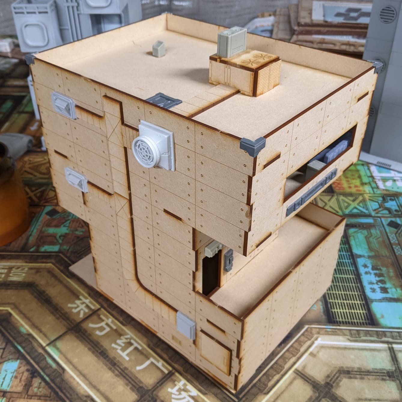
First Up, let’s talk about the terrain itself. As far as MDF terrain goes, this was actually pretty easy stuff to assemble. It does go together in some unexpected ways, so definitely be sure to test fit everything before you glue it, but once everything fits nicely, it goes together very quickly. The models themselves don’t come with intricate layering of MDF that you see in some other kits to produce the high tech and armored patterns, instead all that material goes into making these buildings much larger than you might expect.
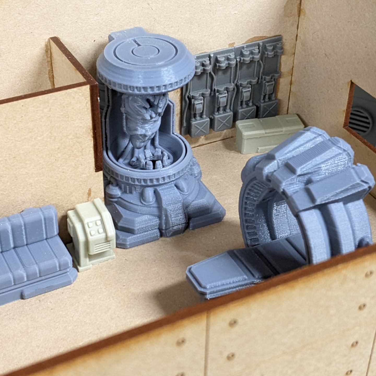
The sheer size of the terrain is actually really interesting, much larger than your typical kits, but instead they’re large enough to feel like actual commercial and residential structures on the table. They’re so big, that you can even put a ton of furniture inside to add to the realism. You can see in the picture above, I was able to build out a secret Shasvastii medical laboratory, with plenty of room for 25 and 40mm bases to maneuver around the scatter terrain, without feeling too cluttered.
Since the models are designed to be brutalist, they are in a lot of ways a nice, minimalist starting point to add accessories to, which is something I love. All those great bits from TTCombat, Antenocitis Workshop, Dragons Rest, etc., feel right at home going into adding a bit of extra character to the design. The models are perfectly good without the accessories too, so it strikes a balance that works well regardless of the level of detail you want to add.
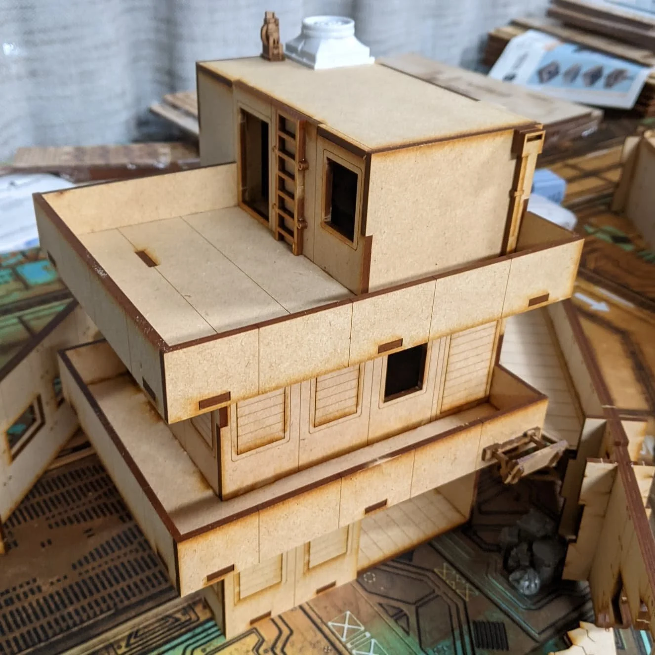
Even in this smaller building (one of the smallest they make), I was able to make each floor feel like a functional space. This is my Ikari safe house, with the bottom floor being a bit of a lounge, middle floor being the living quarters, complete with toilet and sink, while the top level is the locker room and shower. Below is one of the taller, though narrower footprint buildings, which I’ve accessorized each room to be a small studio, there is room for beds, a kitchenette, and even a few other accessories.
Painting
Lately, my time to paint has been basically zero, but I wanted to get this terrain ready to go as quickly as possible. In the picture above, everything was panted entirely with spray paint. In a very short amount of time, I was able to get terrain that looked perfectly fine on the table. All of the buildings started with a modulated spray of a base tone and a lighter shade, so two shades of grey for the one in the foreground, a brown and tan for the back one, and two shades of green for the right. Once tried, I used some painters tape and blocked off some areas to be accent colors (peach in the foreground, white on the right, brown in the back), and repeated the process, using two shades of paint to get a natural look.
All in all, I was able to get a whole table of this terrain painted in a day. The interiors were painted with different colors to contrast from the exteriors, and to feel a bit more realistic, and some of the accessories (like the air conditioning units) were painted separately, but really it went together super fast.
I will definitely be going back and adding weathering, graffiti, posters, and all the stuff I love doing, but for a quick paint job I was very impressed with how the terrain came together. I did find this MDF to be a bit on the thirsty side, so expect to use a couple layers of spray paint, or seal the MDF first (cheap hairspray is great for that) to be sure that it doesn’t just keep soaking it all up.
Gameplay
Without a doubt I’m one of the pickiest people I know when it comes to terrain and gameplay. You might not know this from looking at my intricate tables, but it has all been carefully considered and designed with playing Infinity front and center in my mind. I have some pet peeves that a majority of terrain companies always seem to do (like only accessing the second floor from an emergency ladder), that break the immersion for me.
MDF buildings usually come in two flavors, either it has no interior, or it has every single floor of the building with an interior. Ryan (the brains behind Brutal Cities) has done something really cool, most of the buildings have a single floor of interior. This lets you play inside, but with a lot less hassle of removing layers of a building to access one of the interior floors. Some of the buildings (like my Ikari safe house) still have multiple floors, but in the case of the apartment building, instead of taking off the roof, one of the walls is designed to be removed, giving you access to all three levels at once. As far as interiors go, the size of the buildings, and the way the interiors were designed to be accessed goes a LONG way to making them playable. Normally I hate dealing with interiors, but these buildings actually makes it a lot more fun.
It’s not just interiors that were considered though, the power building (in green) has a tall tower on it, which could easily be a disastrous sniper nest… except he designed the peak to be too narrow for a 25mm base, instead of being a sniper nest, it’s designed to block LOS from the rooftops of the other tall buildings. The pod capsule building on the back right has an elevator door, and doors on all of the landings, so it’s easy enough to access, plus a series of pipes on the other side which can be treated as a ladder.
One of my favorite details (and Jon’s favorite too) is the walls, which have perforated sections that can be detached during games to represent anti-materiel blasting holes through the wall. When you’re setting up the table it’s easy enough to leave some of these sections out to prevent from making unassailable positions.
To see this table in action, check out Jon’s battle report on MERC Recon:
Final Thoughts
For the sake of total transparency, Brutal Cities is a sponsor of Late Night Wargames and did furnish us with the terrain… but it was me who pursued him! Since Ryan started showing off the terrain, I’ve wanted to get my hands on it, and now that I have it, it’s become my preferred terrain to play with. It’s a great combination of aesthetics and playability, which I rarely find in other companies (and which is why I don’t own much MDF terrain). The terrain can be expensive, on a building by building basis, but they are really massive pieces of terrain, you can see above how 5 buildings fills the table nicely, along with some walls and scatter for variety. Overall, I would definitely recommend trying it out if you’re in the market for some great urban terrain for Infinity.
If you’d like to know more about the terrain, Jon and I did a review on Youtube a while back, and we had Ryan on one of our earliest shows as a guest to talk about his experience designing the terrain and starting up his MDF slinging business.


